CSS
CSS
Cascading Style Sheets
Integration into HTML
External (prefered)
linking to an external CSS file in
<head>local link:
<link rel="stylesheet" href="style.css">If semantics used correctly in HTML:
<link>to external websiteInternal
<style>in<head>overwrites any external CSS
Inline
In HTML elements
<tagname style="property:value;">content</tagname>
Seperation of core concerns:
- structure / content (markdown document, HTML)
- style / design / layout
Syntax
Selectors
select HTML elements that we change the attribute of
selector { property:value; }Selectors can be grouped by separating them via comma
','Specificity determines style when multiple selectors match: https://specificity.keegan.st/
Most specific rules wins.
-
Type Selector group via name
<h1>...</h1>
h1	{	font-size:	12pt; }
-
ID Selector unique element via id
'#'<p id="first">…</p> #first { color: red; }
-
Class Selector group via class
'.'<p class="small">…</p> <h1 class="small">…<h1/> .small { font-size: 5pt; }
-
Descendants Separate using space
' 'body p { ... }
-
Children Separate using
'>'body > p { ... }
-
Siblings Separate using
'~'span ~ em { ... }
-
Adjacent Siblings Separate using
'+'p + div { ... }
-
Attribute group via
[att=val]h1[title="a"] { ... } input[invalid] { ... }
-
Pseudo Class
Pseudo Class: i.e. when cursor hovers over a link
a:hoverselects<a>:nth-child, :first-of-type, [attribute*=value], …p:nth-child(2) { ... } p:only-child { ... }
-
Negation
[attribute*:value]body *:not(p) { ... }
-
Every element
*{ ... }
-
Type Selector group via name
Basic Properties
Formatting Text and Fonts
font-family:	  Arial, sans-serif;
font-style:	    italic;
font-size:	    1.2em;
font-weight:	  bold;
color:	        #00ff00;
line-height:	  120%;
text-alignment:	center;
Background
background-color:	   rgb(250,20,16);
background-image:	   url("bg.jpg");
background-repeat:	 repeat-x;
background-position: right	top;
Lists
list-style-type:	circle;
list-style-image:	url('logo.gif');
Borders
border:	        2px solid #A1A1A1;
border-radius:  25px;
box-shadow:     3px	3px	3px	#FF9900;
(Global) Variables
Custom Property Syntax
--name: valueHas to defined in a certain scope (selector)
Selector that property is defined in determines scope of usage ▪
:rootPseudo class is a common best practiceFallback values (if name does not exist):
var(--name, black)h2 { --alarm-color: darkred; } :root { --alarm-color: crimson; }
Pseudo Classes
Use information present outside the document tree based on:
-
form status
:hover, :focusElement the user hovers the mouse over / has selected via tabbing:visited, :linkAll visited/unvisited links
-
user input
:enabled, :disabledWhether input in an element is allowed or not:required, :optionalWhether inputs are required or not:valid, :invalidWhether form / input has valid input or not
-
DOM position
:nth-child(n), :nth-last-childIf element is the n-th child of it's parent:nth-of-type(n)If element is the n-th child of the same type of it's parent
-
form status
Pseudo Elements
::first-line, ::first-letterFirst letter or line::selectionCurrent selection::before, ::afterContent inserted before or after the specified element
Sizes and Proportions
Absolute values - physical or pixel units
For fixed sized rendering (printed pages, images)
Inches (in), Centimeters (cm), Millimeters (mm), Points (pt), Picas (pc), Pixel (px)
Relative values - relative to: parent, font or viewport size
Parent Size
%(relative to parent)Font Sizes
Can be used for anything but rely on font sizes
em: relative to the parent element (which also could be the html)
rem: relative to root element (<HTML>) font size.a) 16 px by default
b) set by the browser settings
Good for accessibility because it is convenient for the user.

rem is more predictable than em and more useful for grids.
c) sized by ourselves - like so:
html{
font-size: 10px;
}
ex(Thex height): relies on font-family.The height of the lower-case x of that font.
Often times, this is about at the middle mark of the font.
ch(character unit): relies on font-family.The width of the glyph for “0”.
In other words, if I were to create a floated element with just a “0” and no whitespace between it, then would be precisely 1ch.
Therefore: width: 40ch; can always contain a string with 40 characters in that particular font.
Viewport Sizes
Viewport - The virtual “window” / Visible area of webpage.
vw: percent of browser window widthvh: percent of browser window heightvmin: min(1vw, 1vh) → chooses smaller viewport lengthvmax: max(1vw, 1vh) → chooses bigger viewport lengthcalculated values
calc: Calculates value (through addition or subtraction)width: calc(2.5em – 3px)
The Box Model
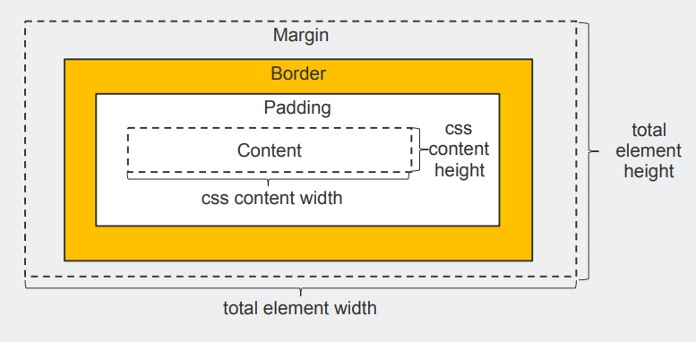
Everything in CSS has a box around it.
Block Box
Examples: Headings (e.g.
<h1>
),
<p>
all use
block
as their outer display type by default.
- breaks new line
- Fills up 100% of available space in container in the inline direction.
- Padding, margin and border will push other elements away
Inline Box
Examples:
<a>
,
<span>
,
<em>
and
<strong>
- inline by default.
- will not break onto a new line.
- Vertical padding, margins, and borders will apply but will not cause other inline boxes to move away from the box.
- Horizontal padding, margins, and borders will apply and will cause other inline boxes to move away from the box.
Layouting
CSS page layout techniques allow us to control where elements on a web page are positioned:
- relative to their default position in normal layout flow
- the other elements around them
- their parent container
- the main viewport/window.
The display property
display: <mode>
sets whether an element is treated
-
as a block or inline element (
<outer-display>type)
-
and the layout used for its children (elements inside the box), such as flow layout, grid or flex (
<inner-display>type)
/* legacy values */
display: block;
display: inline;
display: inline-block;
display: flex;
display: inline-flex;
display: grid;
display: inline-grid;
display: flow-root;/* box generation */
display: none;
display: contents;/* two-value syntax */
display: block flow;
display: inline flow;
display: inline flow-root;
display: block flex;
display: inline flex;
display: block grid;
display: inline grid;
display: block flow-root;/* other values */
display: table;
display: table-row; /* all table elements have an equivalent CSS display value */
display: list-item;/* Global values */
display: inherit;
display: initial;
display: unset;
<display-outside>
These keywords specify the element’s outer display type, which is essentially its role in flow layout.
The direction in which words are displayed in a sentence is according to the Writing Mode of the document.
In English therefore, inline elements display one after the other, starting on the left, and block elements start at the top and move down the page.
block
The element generates a block element box.
Line breaks before and after the element in the normal flow.
inline
The element generates one or more inline element boxes.
The next element will be on the same line if there is space in normal flow.
<display-inside>
Defines the type of formatting context that its contents are laid out in.
flow
(default - without a display-inside parameter)
flow layout = block-and-inline layout, normal flow.
Depending on the value of other properties - such as:
positionRather used for fine tuning, not for layouts.
position: staticdefault, normal flow
position: relativemoving relative to its position in normal flow
position: absolutemoving relative to the edges of its parent element
position: fixedrelative to the browser viewport (not another element)
position: stickystatic, elements hits an offset from viewport, then likefixed
floatclearto turn floating offhas 4 possible values:
leftFloats the element to the left.
rightFloats the element to the right.
noneSpecifies no floating at all. (default)
inheritproperty should be inherited from the parent element.
overflowSets the desired behavior for an element's overflow — i.e. when an element's content is too big to fit in its block formatting context — in both directions.
/* Keyword values */
overflow: visible;
overflow: hidden;
overflow: clip;
overflow: scroll;
overflow: auto;
overflow: hidden visible;/* Global values */
overflow: inherit;
overflow: initial;
overflow: unset;
z-index
defines which elements should be placed in front.
flow-root
generates a new block formatting context → defining new formatting root
table
like HTML
<table>
elements
should be considered a legacy method at this point, for those situations where you have very old browsers without support for Flexbox or Grid.
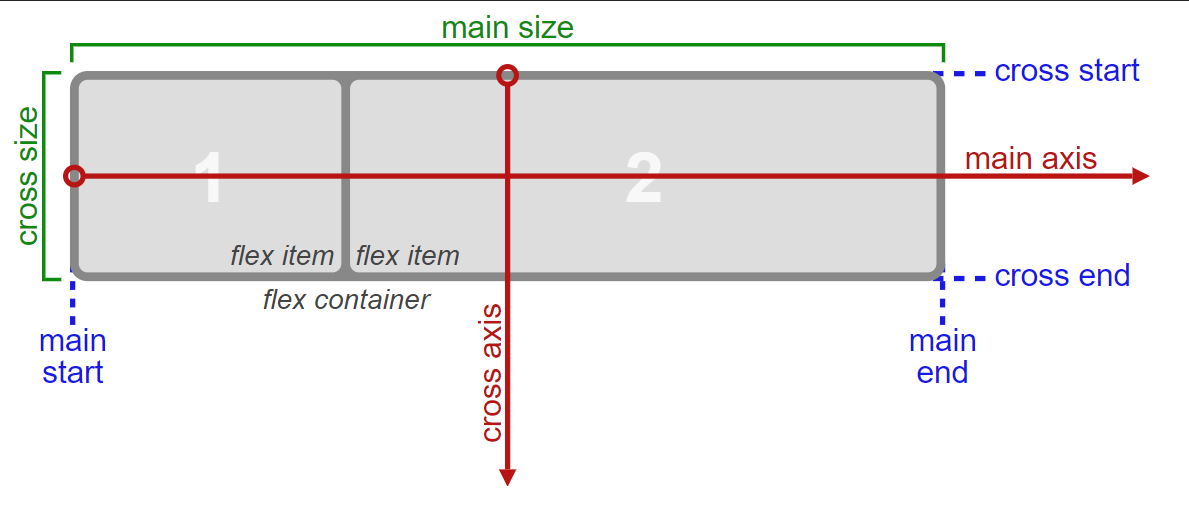
flex
The element behaves like a block element and lays out its content according to the flexbox model . Flexbox is the short name for the Flexible Box Layout Module.
CSS Properties:
flex→ sizingflex: 1;gives the element exactly one fraction unitflex: 200px;→ means that each element must be at least 200px wide
flex-basisspecifies the initial size of the item before CSS makes adjustments with flex-shrink or flex-grow.
flex-shrinkallows an item to shrink if the flex container is too small.
Items shrink when the width of the parent container is smaller than the combined widths of all the flex items within it. → Takes numbers as values.
The higher the number, the more it will shrink compared to other items - similar to fractional units.
flex-growcontrols the size of items when the parent container expands.
flex-directionInitial value is
row. Can be changed tocolumn,column-reverse,row-reverse
flex-wrap→ overflowWhen you have a fixed amount of width or height in your layout eventually your flexbox children will overflow their container, breaking the layout.
(
flex: 200px;→ means that each element must be at least 200px wide)This means extra items move into a new row or column.
The break point of where the wrapping happens depends on the size of the items and the size of the container.
nowrap(default) does not wrap items
wrapwraps items onto multiple lines
wrap-reversewraps items onto multiple lines in reverse order
orderused to tell CSS the order of how flex items appear in the flex container.
By default, items will appear in the same order they come in the source HTML.
Alignment Properties:
Aligns the items in the flex container
justify-content→ x-Axis (main axis)flex-start(default) start
flex-endend
space-betweencenter, with space between items - first and last are locked to edges
space-aroundlikespace-betweenbut first and last are not locked to edges
space-evenlyEven space distribution with full space at bith ends
centercenter
align-content→ y-Axis (cross axis)stretch(default) stretch to fill entire container
flex-startstart
flex-endend
centercenter with equal space
baselinebaselines (is a text concept the line that the letters sit on)
align-self→ individualaccepts the same values as align-items and will override any value set by the align-items property.

grid
The element behaves like a block element and lays out its content according to the grid model .
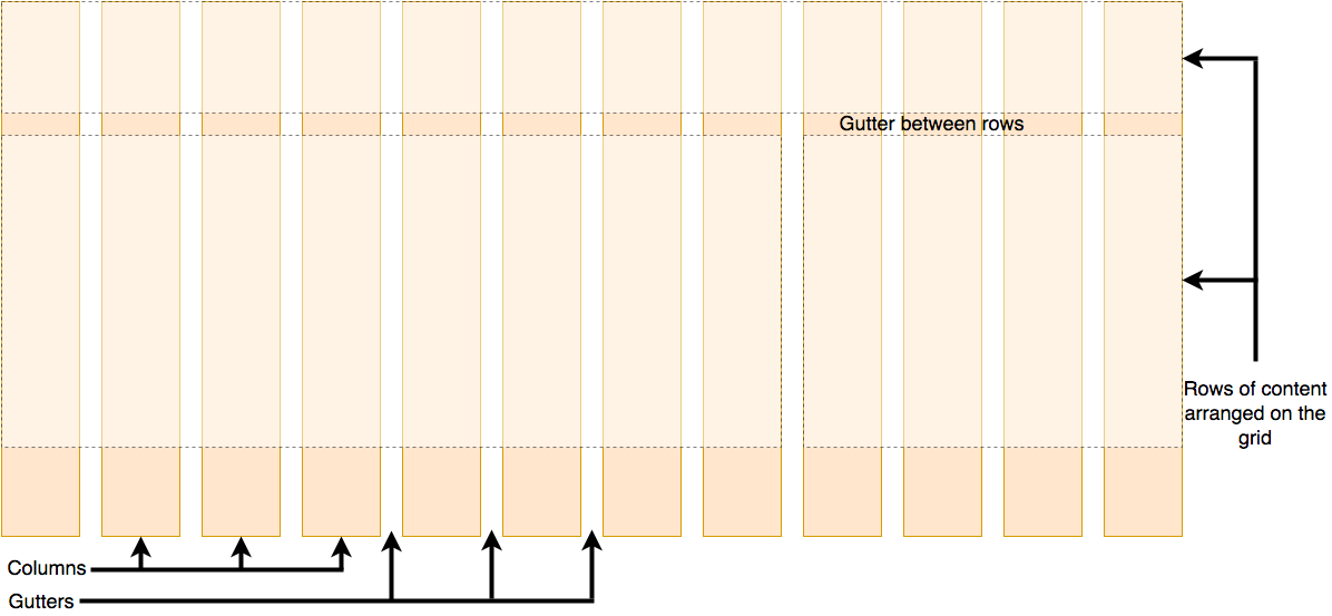
Lining things up in rows and columns + gaps between them ( gutters ).
For designs where elements don’t jump around or change width as we move from page to page, providing greater consistency websites.
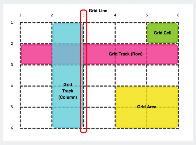
Components:
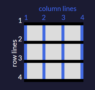
- Grid Line Horizontal and vertical dividing line within a grid
- Grid Track Space between two adjacent grid lines — columns or rows of the grid
- Grid Cell Single unit of the grid
- Grid Area Adjacent grid cells that form a rectangle
Properties:
Grid Container properties
Sizing
grid-template-columnsandgrid-template-rows: The number of parameters given indicates the number of columns or rows in the grid, and the value of each parameter indicates the width or height of each.Spacing
grid-column-gaporgrid-row-gap: sets spacing between cellsUnits
You can use absolute and relative units like
pxandemin CSS Grid to define the size of rows and columns. You can use these as well:fr: sets the column or row to a fraction of the available space,
auto: sets the column or row to the width or height of its content automatically,
%: adjusts the column or row to the percent width of its container.
repeat(): can also useauto-fillorauto-fitas an inputrepeat(auto-fill, minmax(60px, 1fr));When the container changes size, this setup keeps inserting 60px columns and stretching them until it can insert another one. - If your container can't fit all your items on one row, it will move them down to a new one.
minmax(): defines a minimum and maximum value
Grid Cell properties
Indexing starts with 1.
Sizing
grid-column/grid-row: To control the amount of columns / rows an item will consume: the line numbers you want the item to start at / stop at.Alignment (x-Axis)
justify-self:stretch: (default) will make the content fill the whole width of the cell.
start: aligns the content at the left of the cell.
center: aligns the content in the center of the cell,
end: aligns the content at the right of the cell.
Alignment (y-Axis)
align-self
Grid Area properties
grid-template-areas: group cells of your grid together into an area and give the area a custom name.grid-template-areas: "header header header" "advert content content" "footer footer footer";The code above merges the top three cells together into an area named header, the bottom three cells into a footer area, and it makes two areas in the middle row; advert and content. In addition to custom labels, you can use a period (.) to designate an empty cell in the grid.
After creating an area's template for your grid container, you can place an item in your custom area by referencing the name you gave it:
.item1 {
grid-area: header;
}
This lets the grid know that you want the
item1class to go in the area namedheader. In this case, the item will use the entire top row because that whole row is named as the header area.If your grid doesn't have an areas template to reference, you can create an area on the fly for an item to be placed like this:
item1 { grid-area: 1/1/2/4; }The numbers in the example above represent these values:
grid-area: horizontal line to start at / vertical line to start at / horizontal line to end at / vertical line to end at;So the item in the example will consume the rows between lines 1 and 2, and the columns between lines 1 and 4.
Flexbox vs. Grid
Flexbox and Grid are not mutually exclusive within a page.
Flexbox (1D) - Content first ▪ Enable existing content to align and adapt ▪ Rules decided by children
Grid (2D) - Layout first ▪ Specific rigid layout in mind children are placed in ▪ Declaratively control specifically where elements end up — Rules decided by parent
ruby
The element behaves like an inline element and lays out its content according to the ruby formatting model.
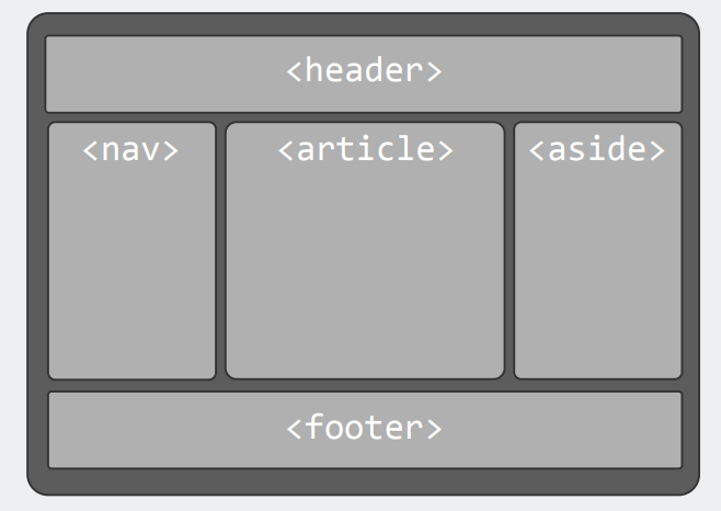
Holy Grail Layout
With Flexbox
- Header, Footer
- Fluid content, fixed sides
- >2 equal height columns
- Content before remaining columns
- “order” property only for visual ordering
main	{	display:	flex; }
main	>	article	{	order:	2;	min-width:	12em;	flex:	1; }
main	>	nav			{	order:	1;	width:	200px; }
main	>	aside		{	order:	3;	width:	200px; }@media	all	and	(max-width:	600px)	{
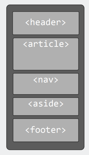
main	{	flex-flow:	column; }
main	>	article,	main	>	nav,	main	>	aside	{
order:	0;	width:	auto;
}
}
<!DOCTYPE html>
...
<header>...</header>
<main>
<article>...</article>
<nav>...</nav>
<aside>...</aside>
</main>
<footer>...</footer>Responsive Design
The terms "fluid layout" and "responsive web design" are two different things.
Using them together is best practice.
Fluid layout - Scaling based on viewport sizes
layout of the page resizes as the window size is changed → Using percentages instead of fixed pixel widths.
💡Deals with the "grey area" between breakpoints in media queries for responsive design → Linear progression between fix-sized designs.
Responsive Design Techniques
- Media queries: Let content fill the container and define min/max constraints
- Use relative units to specify position and size of text and media
- Fluid, Grid-based Layout
- Resposive Images
- Font Scaling
- ...
Fluid Images
Scale images like other content using relative values.
Problems: Browser needs to scale, Large download sizes.
Solution: Responsive and Adaptive Images
Responsive and Adaptive Images
<picture>
<source	src="pic-mobile.jpg"	media="(max-width: 720px)"	/>
<source	src="pic-tablet.jpg"	media="(max-width: 1280px)"	/>
<source	src="pic-desktop.jpg"	/>
<img	src="default.png"	/>	<!–-	User	Agent	not	supporting	picture	element	-->
</picture>
Picture isn't supported on every browser → Using <img> just in case problem occurs
Detect visitor screen size, resolution, and pixel density
Fetch respective image, size or version (additional download!)
Use JavaScript, CSS media queries, and/or HTML5 markup
The Viewport - The virtual “window”
- Visible area of webpage
- Size content to viewport
- Avoid horizontal scrolling
- Avoid necessity to zoom
-
Control viewport in HTML5 through meta-element
<meta name="viewport"
content=
"width=device-width,
initial-scale=1.0,
maximum-scale=3,
minimum-scale=0.5" />
- Consider mobile → Sometimes narrower/wider, default shrinking
Media Queries
@media media-type and (media-feature-rule) {
/* CSS rules */
}
Build complex queries using logical operators (not, and, only).
defining breakpoints and style switches:
@media	only	screen	and	(max-width:	500px)	{	…	}
@media	tv	and	(min-width:	700px)	and	(orientation:	landscape)	{	…	}
<!--	comma	acts	as	'or'	-->
@media	(min-width:	700px),	handheld	and	(orientation:	landscape)	{	…	}
Many modern mobile devices have high-density screens that are difficult to read.
Use media queries and relative values for your fonts:
@media	screen	and	(min-width:	481px)	and	(max-width:	768px)	{
p	{	font-size:	0.9em; }
}
@media	screen	and	(max-width:	480px)	{
p	{	font-size:	0.7em; }
}
Sources
Layouts:
Practice CSS:
Useful tools:
CSS Selectors explained in plain English
Some browsers still dont support newer layouts: http://caniuse.com
Grid examples:
